Increasing D2C Customer Sign-ups by 20% for AI Stroke Detection Device
- Role: UX Designer & Content Strategist (solo contributor)
- Timeline: 6 weeks
- Tools: Figma, Miro, Google Analytics, Heuristic Evaluation
- Timeline: 6 weeks
- Scope: UX audit, content strategy, redesign of website (D2C + B2B flows)
Results & Impact
20%
increase in D2C sign-ups within 3 months of launch.
35%
drop in bounce rate on landing page.
2X
increase in time on site for patient users.
WCAG AA
Accessibility audit passed.
Introduction
Ashmita, CEO of Code Blue AI, grew up watching her grandfather lose his speech and identity after multiple strokes. Years later, her father showed similar symptoms—and even knowing the risks, he delayed treatment. This fear led her to create Code Blue AI, an AI-powered device that detects early stroke symptoms and alerts emergency services. When Code Blue approached me for their website redesign, the challenge was clear: how do we build trust in a life-saving AI device and drive more patients and caregivers to sign up?
The Challenge
Business problem
- Code Blue AI needed a professional, trust-building website to drive direct-to-consumer (D2C) adoption of their AI stroke detection device.
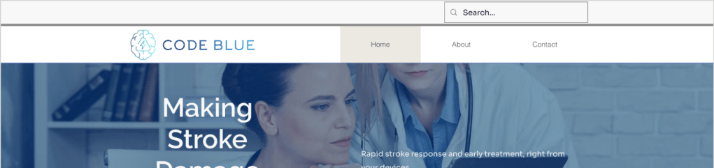
- Current website was described as a “graphic design mess” with unclear goals, vague CTAs, and inconsistent user journeys.
User problem
- Patients and caregivers struggled to understand how the technology worked and whether it was trustworthy.
- Insurers needed clear evidence (FDA clearance, HIPAA compliance, accuracy) to recommend adoption.
Research & Insights
Methods
- Heuristic evaluation
- Content audit
- Stakeholder interview(initial client call)
Key problems identified
- ❌ Inconsistent UX and navigation
- ❌ Vague CTA language (e.g., “Pre-order the technology”)
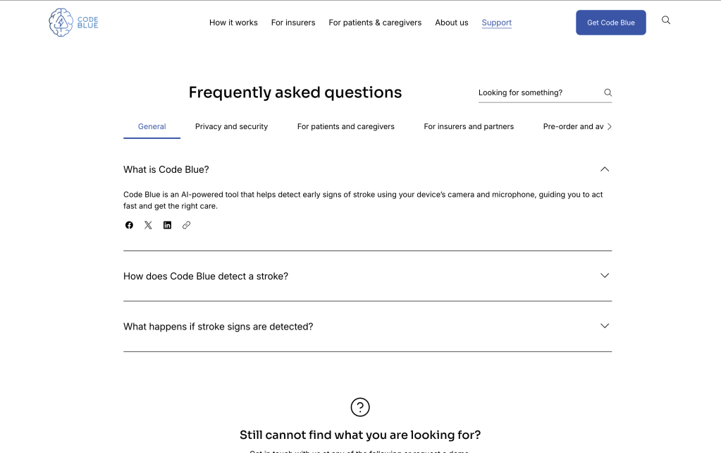
- ❌ Missing Help/FAQ and support channels
- ❌ Inaccessible videos and images
- ❌ No separation between patients/caregivers and insurers journeys
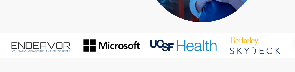
- ❌ Weak trust signals (no awards, recognitions, or testimonials shown)
Design Goals
- Create a clean, modern, professional D2C website.
- Build trust and safety in an AI-powered health device.
- Clarify and separate B2B vs. D2C user flows.
- Improve content structure, readability, and accessibility.
- Drive conversions with clear, action-driven CTAs.
Design Solutions
Clearer Structure & Navigation
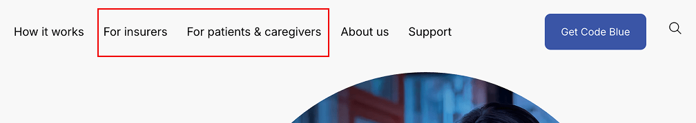
- Reorganized menus into Patients & Caregivers vs Insurers.
- Made search visible + logo clickable to return home.
- Added Help & Documentation menu.
Impact: Reduced cognitive load, improved findability of resources.
📢 Stronger Trust & Credibility
- Banner of supporting organizations on homepage.
- Dedicated section for awards & media coverage.

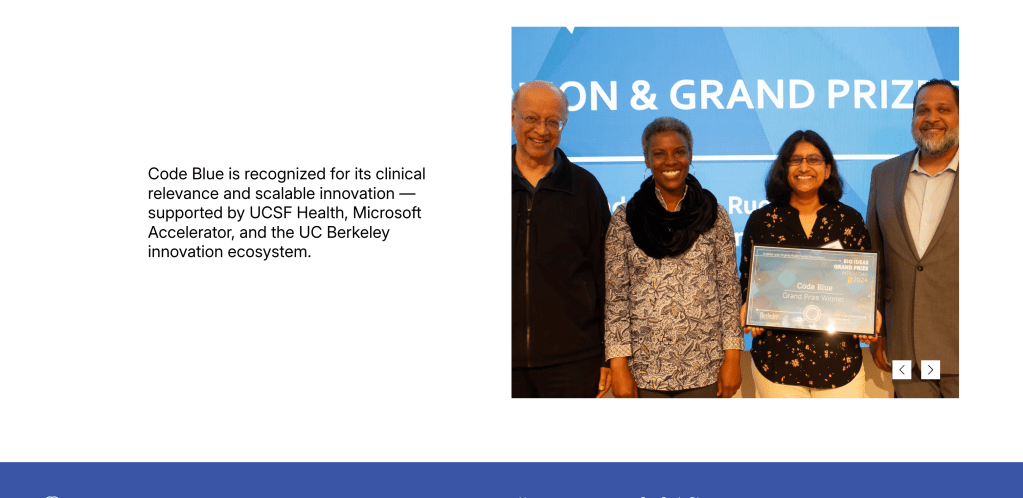
- “About Us” page with the CEO’s personal video message.

Impact: Built confidence in the safety and legitimacy of the device.
🔎 Transparent Product Information
- New “How It Works” page with video + step-by-step guides.
- Clear, instructional product information for different audiences.
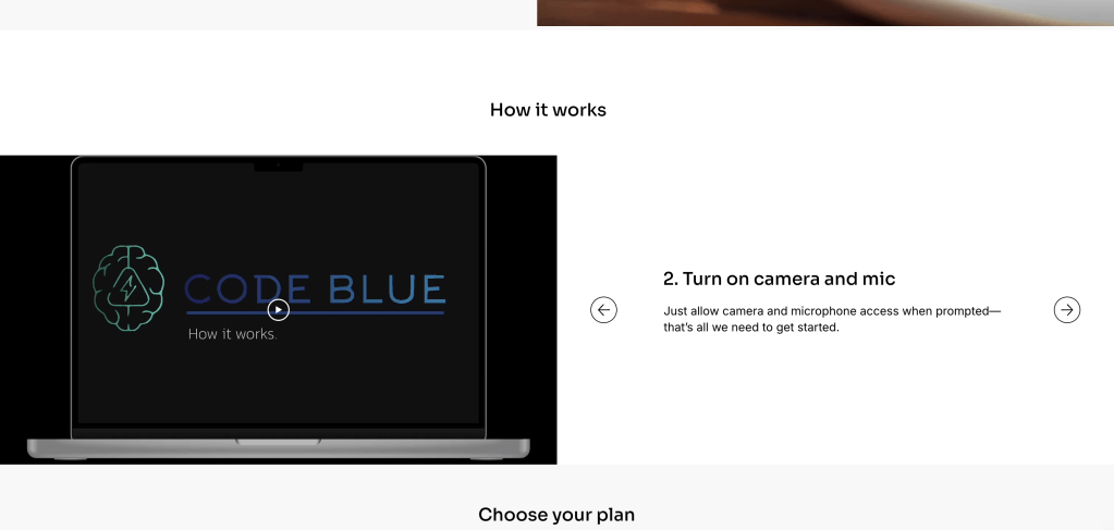
Impact: Improved comprehension for first-time visitors.
🛟 Support & Accessibility
- FAQ + Support page (email + forms).
- Inline form validation with plain language.
- Alt text for all images + WCAG AA compliance.
Impact: Accessible, supportive user experience.

“I signed up for Code Blue to monitor my grandfather’s stroke monitoring. I was skeptical about using AI for monitoring but Code Blue feels trustworthy.”
— Robert P.
7. Key Takeaways
- Accessibility and transparency are not “add-ons” — they’re essential for adoption in health tech.
- Clear role-based content builds trust in healthcare AI products.
- Even small content changes (e.g., CTA clarity) can have measurable conversion impact.
